Many businesses spend time and money building a website, but still do not get enough leads, sales, or inquiries. The website may look attractive at first, but visitors leave quickly because they cannot find information, understand the message, or take action easily.
These problems usually happen because of small but important website design mistakes. When design is not planned around users, it affects trust, engagement, and conversions. Working with a professional web design company can help you avoid these issues and build a website that looks good, works smoothly, and supports business growth.
Why Website Design Mistakes Matter
A website is often the first impression people get of your business, and that first impression can strongly influence their decision. If your website feels confusing, slow, outdated, or unprofessional, visitors may leave before they understand what you offer. This means you could lose potential leads or customers simply because the website does not create trust or guide users properly.
Website design mistakes affect more than just appearance. They can reduce user trust, lower engagement, and stop visitors from taking action, such as contacting you, booking a service, or making a purchase. Avoiding these mistakes helps create a website that looks professional, works smoothly, and supports your business goals. A well planned website gives users a better experience and improves your chances of getting real results.
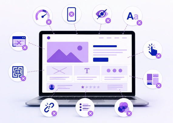
10 Website Design Mistakes to Avoid
Even small design mistakes can affect how users interact with your website. Below are the most common website design mistakes that can reduce trust, engagement, and conversions if they are not fixed properly.
1. Poor Navigation
Navigation is one of the most important parts of website design because it helps users move through your website easily. If visitors cannot find important pages quickly, they may feel confused and leave your site without taking any action.
Your menu should be simple, clear, and easy to understand. Important pages like Services, About, Contact, Pricing, or Products should be easy to access from both desktop and mobile devices.
How to Avoid This Mistake
- Use Clear Menu Labels: Menu names should be simple and direct, such as Home, Services, About, and Contact. Avoid confusing labels that users may not understand.
- Keep Menu Short: Do not overload the main menu with too many links. Keep only the most important pages in the header.
- Add Key Links in Header: Important pages and main calls to action should be easy to find in the header area.
- Use Footer Links: Extra pages like privacy policy, FAQs, service areas, and blogs can be placed in the footer.
- Make Mobile Navigation Easy: Mobile menus should open smoothly, be easy to tap, and show important links clearly.
Clear navigation helps users move through your website without confusion. When visitors can find information easily, they are more likely to stay longer, explore your services, and take action.
2. Cluttered Layout
A cluttered layout makes your website difficult to read, scan, and understand. When there are too many images, buttons, colors, animations, or sections on one page, users can feel distracted and may miss the main message.
A clean layout helps visitors focus on the most important information. Every section should have a clear purpose, enough spacing, and a logical flow so users can understand your website without extra effort.
How to Avoid This Mistake
- Use Proper Spacing: Add enough space between sections, text, images, and buttons. Good spacing makes the design look clean and easier to read.
- Avoid Too Many Elements: Do not overload the page with unnecessary images, icons, animations, or buttons. Keep only what supports the user journey.
- Keep Content Organized: Arrange content in a clear order so users can follow the message step by step. Use headings and short sections to improve readability.
- Highlight Key Information: Important details like services, benefits, offers, and calls to action should stand out clearly. Avoid giving equal attention to everything.
- Use Clean Layouts: Choose simple layouts that guide users naturally. A clean structure makes the website look more professional and trustworthy.
A simple layout improves readability and user experience. When your website feels clean and organized, users can understand your message faster and are more likely to stay engaged.
3. Slow Loading Speed
A slow loading website can frustrate users and make them leave before the page fully opens. Most visitors expect a website to load quickly, especially when they are browsing on mobile or looking for quick information.
Website speed can be affected by large images, heavy animations, poor hosting, unnecessary plugins, and unoptimized code. A faster website creates a smoother browsing experience and helps users stay engaged for longer.
How to Avoid This Mistake
- Compress Images: Reduce image file sizes before uploading them to the website. This helps pages load faster without affecting visual quality too much.
- Avoid Heavy Animations: Too many animations or effects can slow down the website. Use only simple animations that improve the experience.
- Use Reliable Hosting: Poor hosting can affect website speed and uptime. Choose a hosting provider that supports fast loading and stable performance.
- Remove Extra Plugins: Too many plugins can add unnecessary load to your website. Keep only the plugins that are useful and properly maintained.
- Optimize Website Code: Clean and optimized code helps your website load faster. Remove unused CSS, scripts, and unnecessary elements where possible.
Better speed also helps users trust your website more and increases the chances of them taking action.
4. Not Mobile Friendly
Many users browse websites from mobile devices, so your website must work properly on smaller screens. If the layout breaks, text becomes too small, or buttons are hard to tap, users may leave and choose another business.
A mobile friendly website should adjust smoothly to different screen sizes. Text, buttons, images, menus, and forms should be easy to read and use on mobile without zooming or horizontal scrolling.
How to Avoid This Mistake
- Use Responsive Design: Make sure your website layout adjusts automatically for mobile, tablet, and desktop screens. This helps users get a smooth experience on any device.
- Make Buttons Easy to Tap: Buttons should be large enough and have enough spacing around them. This helps users click the right option without frustration.
- Keep Text Readable: Font sizes should be comfortable on mobile screens. Users should not need to zoom in to read your content.
- Avoid Horizontal Scrolling: Your website should fit properly within the screen width. Side scrolling usually means some element is not responsive.
- Test on Real Devices: Check your website on actual mobile phones and tablets. Real device testing helps you find issues that may not appear in design tools.
When users can browse comfortably, they are more likely to stay longer, trust your business, and contact you.
5. Weak Call to Action
A website should guide users toward the next step clearly. If your call to action is missing, unclear, or placed in the wrong area, visitors may leave without contacting you, booking a service, requesting a quote, or making a purchase.
Buttons like Contact Us, Get a Quote, Book Now, or Buy Now should be easy to see and understand. A strong call to action helps users know exactly what to do next and makes the website more conversion focused.
How to Avoid This Mistake
- Use Clear Button Text: Button text should be simple and action focused. Use direct words like Contact Us, Get a Quote, Book Now, or Buy Now.
- Place CTAs in Key Sections: Add call to action buttons in important areas such as the hero section, service sections, pricing section, and page end.
- Make Buttons Noticeable: CTA buttons should stand out visually through color, size, and spacing. Users should not have to search for them.
- Avoid Too Many CTAs: Too many different actions can confuse users. Keep the main action clear and consistent across the page.
- Repeat Important CTAs: Repeat your main CTA where needed, especially after explaining services, benefits, or reasons to choose your business.
Clear calls to action help users move forward with confidence. When users understand the next step, they are more likely to take action, which improves leads, inquiries, and conversions.
6. Poor Typography
Typography plays an important role in how users read and understand your website content. If the fonts are too small, too decorative, or inconsistent across pages, users may find it difficult to focus on your message.
How to Avoid This Mistake
- Use Readable Fonts: Choose simple and clean fonts that are easy to read on both desktop and mobile. Avoid overly decorative fonts for main content.
- Keep Font Styles Consistent: Use the same font family and style across your website. Consistency makes the design look more polished and organized.
- Use Proper Font Sizes: Headings, subheadings, and body text should have clear size differences. This helps users scan the page easily.
- Maintain Good Line Spacing: Proper spacing between lines makes content more comfortable to read. Tight spacing can make paragraphs feel crowded.
- Avoid Too Many Font Combinations: Using too many fonts can make the website look messy. Stick to one or two font families for a clean design.
When users can read comfortably, they stay longer, engage more with your website, and are more likely to take action.
7. Inconsistent Design
Inconsistent design can make a website feel unprofessional and confusing. If every page uses different colors, fonts, button styles, spacing, or image styles, users may feel like they are moving between different websites instead of one clear brand.
How to Avoid This Mistake
- Use the Same Color Palette: Stick to a fixed set of brand colors across all pages. This creates a clean and recognizable visual identity.
- Keep Button Styles Consistent: Buttons should follow the same design style, including color, shape, size, and hover effect. This makes actions easier to recognize.
- Follow One Typography System: Use consistent fonts, heading sizes, and paragraph styles. This keeps the website readable and visually balanced.
- Maintain Similar Spacing: Keep spacing between sections, text, images, and buttons consistent. This helps the website feel organized and professional.
- Use Consistent Icons and Images: Icons and images should follow the same style and quality. Mixed visuals can make the website look unplanned.
Consistent design makes your website look polished and reliable. It helps users feel more comfortable while browsing your site and builds stronger trust in your brand.
8. Ignoring SEO Basics
A website should not only look attractive, it should also be easy for search engines to understand. If SEO basics are ignored during the design process, your website may struggle to appear in search results, even if the design looks professional.
Designers should consider important SEO elements like heading structure, image alt text, page speed, mobile friendliness, and internal linking while planning the website. These small details help search engines understand your pages better and can support long term visibility.
How to Avoid This Mistake
- Use Proper Heading Structure: Use headings in the correct order, such as H1 for the main title, H2 for main sections, and H3 for subtopics. This helps both users and search engines understand the content.
- Add Alt Text for Images: Image alt text explains what an image is about. It helps search engines understand visuals and also improves accessibility for users.
- Keep URLs Simple: Use short and clear URLs that describe the page topic. Avoid long or confusing links with unnecessary numbers or symbols.
- Improve Website Speed: Fast loading pages improve user experience and support SEO performance. Compress images and avoid heavy elements that slow down the site.
- Make the Site Mobile Friendly: A mobile friendly website works smoothly on all screen sizes. Since many users browse from mobile devices, responsive design is important for both users and search visibility.
When users can find your website easily, you get more opportunities to generate traffic, leads, and business inquiries.
9. Using Low Quality Images
Images play a major role in how users see your website and your business. Blurry, stretched, pixelated, or irrelevant images can reduce trust and make the website look unprofessional, even if the layout is good.
High quality images help communicate your message clearly and make the design more engaging. They should match your brand, support your content, and be optimized so they do not slow down the website.
How to Avoid This Mistake
- Use Clear and Relevant Images: Choose images that match your business, service, product, or message. Avoid using random visuals that do not add value to the page.
- Avoid Stretched Visuals: Images should not look stretched, cropped badly, or pixelated. Always use the correct image size and ratio for each section.
- Compress Images: Large image files can slow down your website. Compress images before uploading so they load faster while still looking clear.
- Use Consistent Image Style: Keep image style consistent across the website. For example, avoid mixing too many different photo styles, filters, or illustration types.
- Support the Message: Every image should help explain or strengthen the content. Use visuals that guide users and make the page easier to understand.
Good images improve visual appeal and build trust with users. When images are clear, relevant, and optimized, they support both design quality and website performance.
10. Skipping Testing Before Launch
Many website issues are only noticed after proper testing. Broken links, non working forms, layout problems, slow pages, and mobile issues can affect user experience if they are not checked before launch.
Testing helps you find and fix these mistakes before real users visit the website. It ensures the final website feels polished, works smoothly, and is ready to support your business goals.
How to Avoid This Mistake
- Test All Buttons and Links: Click every button and link to make sure they open the correct page or action. Broken links can frustrate users and reduce trust.
- Check Forms and Submissions: Test contact forms, inquiry forms, newsletter forms, and booking forms. Make sure submissions are received properly.
- Review Mobile and Tablet Views: Check the website on different screen sizes to ensure the layout, text, images, and buttons work correctly.
- Test Website Speed: Review how quickly your pages load on desktop and mobile. Slow pages should be optimized before launch.
- Check Different Browsers: Test the website on browsers like Chrome, Safari, Firefox, and Edge. This helps ensure users get a consistent experience.
A properly tested website creates a smoother, more professional experience and gives visitors more confidence in your business.
How to Avoid Website Design Mistakes
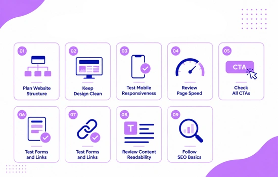
Avoiding website design mistakes starts with proper planning. Before designing, it is important to understand the business goals, target audience, required pages, and user journey clearly.
- Plan Website Structure: Decide all important pages, sections, and navigation flow before starting the design.
- Keep Design Clean: Avoid unnecessary elements and keep the layout simple, clear, and easy to understand.
- Test Mobile Responsiveness: Check how your website looks and works on mobile, tablet, and desktop devices.
- Review Page Speed: Make sure pages load quickly by optimizing images, code, plugins, and other heavy elements.
- Check All CTAs: Ensure buttons like Contact Us, Get a Quote, or Book Now are visible and easy to understand.
- Test Forms and Links: Check that all forms, buttons, and links work properly before the website goes live.
- Review Content Readability: Use clear headings, short paragraphs, readable fonts, and simple language.
- Follow SEO Basics: Use proper headings, image alt text, mobile friendly design, and simple URLs.
Following a proper process helps reduce mistakes and improves website quality. A clear checklist keeps the design focused, user friendly, and result driven.
Conclusion
Website design mistakes may look small, but they can have a big impact on user experience, trust, and conversions. Poor navigation, slow speed, weak CTAs, unclear layouts, and mobile issues can stop visitors from taking action even when your business offers good products or services.
The best way to avoid these problems is to design with users in mind, test everything properly, and follow a clear process before launch. If your website is not giving the results you expected, contact us for professional web design services and build a clean, user friendly, and conversion focused website.