
Have you ever opened a website on your phone and struggled to read the text, click a button, or navigate the menu?
Most people leave that website within seconds and look for another business that offers a smoother experience. In today’s digital world, customers expect websites to work perfectly on mobile devices, and if they do not, businesses can lose valuable enquiries and sales.
Many business owners in New Zealand still use outdated websites that were mainly designed for desktop users. The problem is that most customers now browse, search, and shop directly from their smartphones. A mobile friendly website NZ businesses can rely on is no longer optional. It has become an important part of building trust, improving search rankings, and increasing conversions online.
If you are planning to improve your online presence, working with a professional web design company can help create a website that performs well on all devices while delivering a better experience for your customers.
What Is a Mobile Friendly Website?
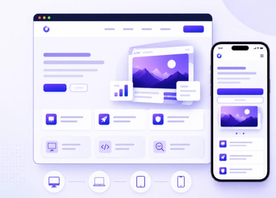
A mobile friendly website is a website designed to automatically adapt and function properly on different screen sizes, including smartphones, tablets, laptops, and desktop computers. The layout, images, text, and navigation elements adjust according to the user’s device, making the website easy to read and interact with without the need for zooming or excessive scrolling. A mobile friendly website ensures that visitors can quickly access information, click buttons comfortably, fill out forms easily, and navigate between pages without frustration. This creates a seamless browsing experience that keeps users engaged and encourages them to stay on the website longer.
A responsive and mobile friendly design not only improves user experience but also helps build trust and professionalism for a business. Additionally, search engines like Google prioritise mobile friendly websites in search rankings, which can improve online visibility, increase website traffic, and generate more leads and conversions for businesses.
Key Features of a Mobile Friendly Website
- Responsive Layout: Automatically adjusts the website layout to fit different screen sizes, including smartphones, tablets, and desktops.
- Fast Loading Speed: Pages load quickly on mobile devices, helping users access information without delays.
- Easy-to-Read Text: Font sizes and spacing are designed for comfortable reading without needing to zoom in.
- Clickable Buttons with Proper Spacing: Buttons and links are large enough and spaced correctly for easy tapping on touch screens.
- Mobile-Friendly Navigation Menus: Simple and organised menus help users browse the website smoothly on smaller screens.
- Optimised Images and Content: Images are compressed and content is structured properly to improve performance and readability on mobile devices.
- User-Friendly Forms: Contact forms and enquiry sections are easy to fill out on smartphones and tablets.
- Compatible Across Multiple Devices: The website works properly across different mobile devices, operating systems, and browsers.
When a website is properly designed for mobile users, visitors are more likely to stay longer, explore more pages, and contact the business for products or services.
Why Mobile Usage Is Growing Rapidly in NZ
The use of smartphones and mobile devices has increased significantly across New Zealand over the past few years. People now rely on mobile phones for almost every online activity, including searching for local businesses, comparing services, reading customer reviews, shopping online, booking appointments, and contacting companies directly. Mobile browsing has become faster, more convenient, and accessible, making it the preferred choice for many users throughout the day.
As internet usage habits continue to change, businesses in NZ must adapt to meet customer expectations. A website that works perfectly on mobile devices is no longer optional, it has become an essential part of creating a strong online presence. Businesses that fail to provide a smooth mobile experience risk losing potential customers to competitors with better mobile-friendly websites.
Mobile Users Expect Instant Access
Modern internet users expect websites to load quickly and provide information instantly. Most visitors will not wait for slow-loading pages or struggle with difficult navigation. If a website is not optimised for mobile devices, users often leave within seconds and move to another business website that offers a better experience.
Common Reasons Users Leave Non-Mobile-Friendly Websites
- Tiny text that is difficult to read on smaller screens
- Slow page loading times
- Buttons and links that are hard to tap
- Confusing or poorly designed navigation menus
- Content that does not fit properly on mobile screens
- Images that load incorrectly or appear too large
- Forms that are difficult to complete on smartphones
Customers often judge the quality of a business based on how professional its website looks on mobile devices. Businesses that improve their mobile experience are more likely to keep visitors engaged and convert them into customers.
How Mobile Friendly Websites Improve User Experience
User experience is one of the most important factors that determine whether visitors stay on a website or leave within seconds. A mobile friendly website is designed to provide users with a smooth, fast, and easy browsing experience across all devices, especially smartphones and tablets. When visitors can quickly access information, navigate pages effortlessly, and interact with the website without technical issues, they are more likely to trust the business and continue exploring its services.
Better Navigation and Readability
Mobile friendly websites are structured to make browsing easier and more comfortable for users on smaller screens. Content is arranged clearly, menus are simplified, and important information is displayed in a way that improves readability and accessibility.
Key Improvements That Enhance User Experience
- Simple and easy-to-use navigation menus
- Readable font sizes without needing zoom
- Clean and organised page layouts
- Proper spacing between content sections
- Easy-to-click buttons and links
- Fast access to important information
- Mobile-optimised contact forms and call buttons
These improvements help users move through the website smoothly without confusion or frustration. Visitors can quickly find the information they need, whether they are looking for services, pricing, contact details, or business information.
SEO Benefits of a Mobile Friendly Website
A mobile friendly website does more than improve appearance and usability — it also plays a major role in search engine optimisation (SEO). Search engines like Google prioritise websites that provide a strong mobile experience because most users now browse the internet using smartphones and tablets. If your website is not properly optimised for mobile devices, it may struggle to appear in top search results, which can reduce your online visibility and potential customer enquiries.
Better Rankings on Google
Google uses a system called mobile-first indexing, which means it primarily evaluates the mobile version of your website when determining search rankings. If your mobile website performs poorly, it can negatively affect your visibility in search engine results, even on desktop searches.
A properly optimised mobile friendly website can improve several important SEO factors that influence rankings and online performance.
SEO Advantages of a Mobile Friendly Website
- Improved visibility in Google search results
- Better user engagement and longer visit duration
- Lower bounce rates from mobile users
- Faster website loading speed
- Easier crawling and indexing by search engines
- Higher organic traffic from mobile searches
- Better local SEO performance in New Zealand
- Increased chances of generating leads and enquiries
Over time, improving mobile usability can help businesses achieve stronger SEO results, attract more local customers, and stay competitive in the growing digital market in NZ.
Signs Your Website Is Not Mobile Friendly
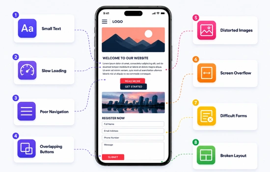
Many business owners are unaware of mobile usability issues until they notice a drop in website traffic, lower enquiries, or customer complaints. Identifying these warning signs early can help improve user experience and prevent potential customers from leaving your website.
- Small Text: Website text appears too small on mobile devices, making it difficult for users to read content comfortably without zooming in.
- Slow Loading: Pages take too much time to load on smartphones, which can frustrate visitors and increase bounce rates quickly.
- Poor Navigation: Menus may feel confusing or difficult to use, preventing users from finding important information or service pages easily.
- Overlapping Buttons: Buttons and links appear too close together, making it hard for users to tap the correct option on smaller screens.
- Distorted Images: Images may look stretched or incorrectly sized on mobile devices, reducing the overall visual quality of the website.
- Screen Overflow: Content extends outside the mobile screen, forcing users to scroll sideways to read information properly.
- Difficult Forms: Contact forms can become difficult to complete on smartphones, creating frustration during enquiries or bookings.
- Broken Layout: Website sections may appear cluttered or misaligned on mobile devices, creating a poor browsing experience for visitors.
These issues can create a poor browsing experience and encourage visitors to leave the website. Improving mobile usability helps increase customer satisfaction, engagement, and conversions.
Features Every Mobile Friendly Website Should Have
The right mobile website features not only improve user experience but also help businesses increase engagement, build trust, and encourage visitors to take action. A well-optimised mobile website can lead to higher enquiries, better customer retention, and improved search engine performance.
- Fast Loading Speed: Mobile users expect websites to load within seconds, and slow loading pages often cause visitors to leave before exploring the website.
- Responsive Design: A responsive website automatically adjusts layouts, images, and content to fit different screen sizes without affecting usability.
- Click-to-Call Buttons: Mobile users prefer quick and easy communication, and click-to-call buttons help customers contact businesses instantly.
- Optimised Images: Properly compressed images improve website speed while maintaining visual quality across smartphones and tablets.
- Mobile-Friendly Forms: Simple and easy-to-complete forms encourage visitors to submit enquiries without frustration on smaller screens.
- Easy Navigation: Clear menus and organised page structures help users browse the website smoothly and find information quickly.
- Readable Content: Proper font sizes and spacing improve readability and create a more comfortable browsing experience for mobile users.
- Touch-Friendly Buttons: Buttons should be large enough and properly spaced to allow accurate tapping on touchscreen devices.
A properly optimised mobile friendly website can improve business credibility, increase customer engagement, and generate higher conversion rates over time.
Common Mistakes Businesses Make
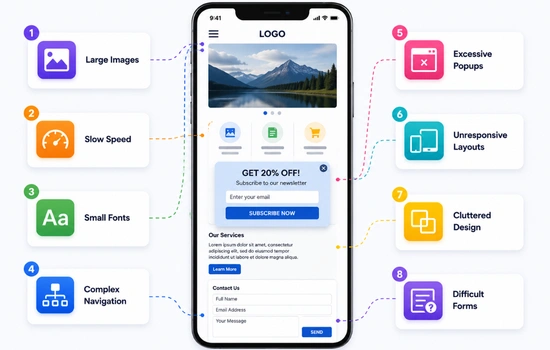
Avoiding common mobile website errors can help businesses provide a smoother browsing experience, improve engagement, and increase customer satisfaction. Even small improvements in mobile optimisation can make a noticeable difference in retaining visitors and generating enquiries.
- Large Images: Heavy image files can slow down website loading speed, causing frustration for users browsing on mobile devices.
- Slow Speed: Ignoring mobile website speed can increase bounce rates and negatively affect both SEO performance and conversions.
- Small Fonts: Text that is too small makes reading difficult on smartphones and reduces overall user experience.
- Complex Navigation: Too many menu items or confusing navigation structures can make it hard for users to browse the website.
- Excessive Popups: Large or repeated popups can interrupt browsing and create frustration for mobile visitors.
- Unresponsive Layouts: Websites that do not adjust properly to different screen sizes can appear broken or difficult to use.
- Cluttered Design: Too much content or overcrowded sections can overwhelm users and reduce readability on smaller screens.
- Difficult Forms: Long or poorly designed forms can discourage users from completing enquiries on mobile devices.
Businesses that optimise their websites for mobile users are more likely to keep visitors engaged, improve customer trust, and increase conversion rates over time.
Conclusion
A website that does not perform properly on mobile devices can drive potential customers away before they even learn about your business. Today’s users expect fast, simple, and mobile-friendly browsing experiences, and businesses that fail to provide this often struggle with lower engagement and fewer enquiries.
Investing in a mobile friendly website NZ businesses can trust is one of the smartest ways to improve user experience, increase search visibility, and generate more leads online. A professionally designed mobile website helps build customer confidence while making your business more accessible across all devices.
If your current website feels outdated or difficult to use on mobile phones, now is the right time to improve it. Contact professionals for expert mobile website solutions that help your business grow and perform better online. You can also make an appointment to discuss your website requirements and find the right solution for your business goals.