Does your website look perfect on a laptop but feel messy, broken, or difficult to use on a mobile phone?
This is a common problem for many business owners. Users may visit your website from different devices, but if the layout does not adjust properly, they may leave before reading your content or contacting you.
Today, people expect websites to work smoothly on mobiles, tablets, laptops, and desktops. If your website is hard to read, slow to load, or difficult to navigate on smaller screens, it can affect trust, leads, and sales. This is where responsive web design becomes important. A professional web design company can help you build a website that looks clean, works smoothly, and gives users a better experience on every device.
What Is Responsive Web Design?
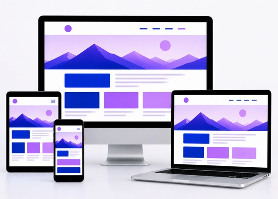
Responsive web design is a website design approach that allows your website to adjust automatically based on the screen size of the device being used. In simple words, your website should look and work properly whether someone opens it on a mobile phone, tablet, laptop, or desktop.
Instead of creating separate websites for different devices, responsive design uses flexible layouts, images, and sections that resize and rearrange themselves. This helps users browse your website comfortably without zooming, scrolling sideways, or struggling to click buttons.
For example, on a desktop, your website may show three service boxes in one row. On mobile, those same boxes may stack one below another so users can read them easily. This adjustment makes the website more practical and user friendly.
Responsive web design is not only about fitting the screen. It is about making sure users get a smooth experience, no matter which device they use.
Why Responsive Web Design Matters
Responsive design matters because user behavior has changed. Many people now search for services, compare businesses, read reviews, and fill inquiry forms directly from their phones. If your website does not work smoothly on all devices, you may lose valuable leads and sales.
- Better User Experience: A responsive website adjusts properly to different screen sizes. Users can read content, browse pages, and interact with buttons easily without zooming or struggling.
- Lower Bounce Rate: When your website loads properly and looks clean on mobile, visitors are more likely to stay longer. A smooth experience reduces the chances of users leaving quickly.
- More Inquiries: Clear layouts, visible contact buttons, and easy forms make it simple for users to contact your business. This can directly improve inquiries and conversions.
- Stronger Trust: A website that looks professional on every device creates a better impression. Users are more likely to trust a business that provides a smooth and modern browsing experience.
- Better Long Term Value: One responsive website works across desktop, tablet, and mobile devices. This saves time and effort because you do not need separate versions for different screens.
When people can browse comfortably on any device, they are more likely to trust your business, stay longer, and take action.
How Responsive Web Design Works
Responsive web design works by allowing website elements to adjust according to the screen size. This means the layout, images, text, buttons, and sections change their size or position depending on whether the user is browsing from a desktop, tablet, or mobile device.
The main goal is to keep the website easy to read, easy to use, and visually balanced on every screen. A responsive website should feel natural to use, no matter which device the visitor is using.
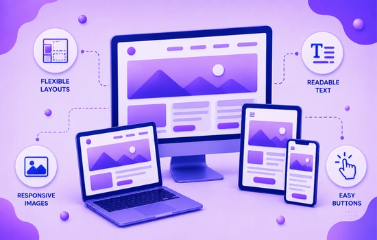
Flexible Layouts
A flexible layout adjusts itself instead of staying fixed in one size. This helps the website fit different screen widths without breaking the design or forcing users to scroll sideways.
For example, a desktop layout with three columns can turn into a single column layout on mobile. This makes the content easier to read and keeps the page clean on smaller screens.
Responsive Images
Images should resize properly based on the device screen. If images are too large, too small, stretched, or cut off, the website can look unprofessional and difficult to use.
Responsive images maintain visual quality while fitting naturally inside the layout. This keeps the design balanced and improves the overall browsing experience.
Readable Text
Text should be easy to read on all devices without zooming. If users need to pinch the screen to read your content, the website is not providing a good mobile experience.
Good responsive design uses suitable font sizes, proper line spacing, and comfortable content width. This helps users read your message clearly and stay engaged for longer.
Easy Buttons
Buttons should be large enough to tap easily on mobile devices. If buttons are too small or placed too close together, users may click the wrong option or leave out of frustration.
Clear and tappable buttons help users take action faster. Whether it is calling your business, filling a form, or buying a product, the action should feel simple and smooth.
When layouts, images, text, and buttons adjust properly, your website becomes easier to use and more effective across all devices.
Key Elements of Responsive Web Design
A responsive website needs more than just a flexible layout. It should be planned carefully so users can browse smoothly, read content easily, and take action from any device.
Each element plays an important role in creating a better user experience. When these elements work together, your website feels natural, professional, and easy to use across desktop, tablet, and mobile screens.
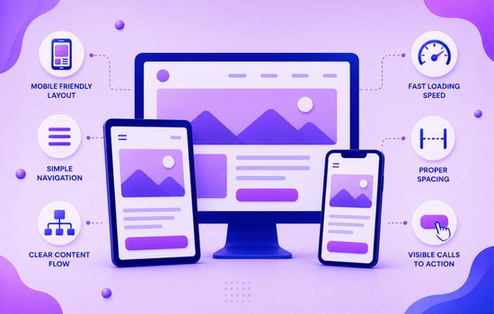
Mobile Friendly Layout
The layout should adjust properly on smaller screens without horizontal scrolling. Users should be able to move through the website naturally without zooming or dragging the page sideways.
A mobile friendly layout keeps sections clean, readable, and easy to follow. It helps users understand your content quickly and improves the overall browsing experience.
Simple Navigation
Navigation should be easy to use on both desktop and mobile devices. On mobile, menus should be simple, clear, and easy to open so users can find important pages quickly.
If users cannot find what they need within a few seconds, they may leave the website. Clear navigation keeps users engaged and helps them move through the site with confidence.
Clear Content Flow
Content should be arranged in a logical order so users can understand your message step by step. They should quickly know what your business offers, why it matters, and what action they should take next.
A clear content flow reduces confusion and keeps users interested. It also helps guide visitors toward important sections like services, benefits, testimonials, and contact details.
Fast Loading Speed
Responsive design should also consider website speed. Large images, heavy animations, and unnecessary elements can slow down the website, especially on mobile devices.
A fast website creates a smoother experience and helps visitors stay longer. It also improves trust because users expect websites to load quickly and work without delay.
Proper Spacing
Spacing is very important on smaller screens. If text, buttons, images, and sections are placed too close together, the website feels crowded and difficult to use.
Balanced spacing makes the design look clean and comfortable. It improves readability and helps users focus on the most important information without feeling overwhelmed.
Visible Calls to Action
Buttons like Contact Us, Get a Quote, Book Now, or Call Now should be easy to find on every device. Users should not have to search for the next step after reading your content.
A clear call to action helps guide visitors toward becoming leads or customers. When buttons are visible and easy to tap, users are more likely to take action.
When your layout, navigation, content, speed, spacing, and calls to action are properly planned, your website becomes more user friendly and conversion focused.
Benefits of Responsive Web Design for Businesses
For business owners, responsive design is not just a technical feature. It is a practical way to improve user experience, build trust, and increase the chances of getting more inquiries or sales.
- Improves User Experience: Users can browse your website without struggling with layout issues, zooming, or broken sections. A smooth experience keeps visitors engaged and encourages them to explore your services.
- Supports SEO Performance: Search engines prefer websites that offer a good user experience across devices. A responsive website supports better visibility because it works well on both mobile and desktop.
- Increases Conversion Chances: When users can easily read content, tap buttons, and submit forms, they are more likely to take action. Responsive design removes barriers that may stop users from contacting your business.
- Reduces Maintenance Work: Instead of managing separate desktop and mobile versions, you can manage one responsive website. This saves time and keeps your design, content, and updates consistent.
- Builds Professional Image: A website that looks clean and works well on every device shows that your business is modern and reliable. This creates a stronger first impression and builds trust with visitors.
When visitors get a smooth experience on any device, they are more likely to stay, trust your brand, and take action.
Common Responsive Design Mistakes
Avoiding these mistakes helps your website feel smoother, cleaner, and easier to use on all devices. It also improves engagement and increases the chances of users taking action.
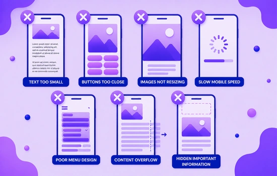
- Text Too Small: Users should not need to zoom in to read your content. Font sizes should be comfortable on mobile, tablet, and desktop screens.
- Buttons Too Close: Buttons should have enough space around them so users can tap easily. Crowded buttons can lead to wrong clicks and frustration.
- Images Not Resizing: Images should adjust properly according to screen size. If images are stretched, cut off, or too large, the layout can look unprofessional.
- Slow Mobile Speed: Mobile users expect pages to load quickly. Heavy images, unnecessary scripts, and large design elements can slow down the experience.
- Poor Menu Design: Navigation should be simple and easy to use on small screens. A confusing mobile menu makes it harder for users to find important pages.
- Content Overflow: Text, images, or sections should not go outside the screen. Overflow issues make the website look broken and difficult to browse.
- Hidden Important Information: Key details like contact buttons, services, forms, and business information should be easy to access. Users should not have to search too much.
When users can read, navigate, and take action easily, they stay longer and trust your website more.
Conclusion
Responsive web design is no longer optional for businesses that want to create a strong online presence. Users visit websites from different devices every day, and if your website does not adjust properly, you may lose their attention, trust, and potential inquiries. A responsive website helps users read content easily, browse smoothly, and take action without confusion.
By focusing on mobile friendly layouts, clear navigation, fast loading speed, readable content, and visible calls to action, you can create a better experience for every visitor. If your current website is difficult to use on mobile or does not perform well across devices, contact us today to improve your website and create a responsive design that supports better engagement, trust, and business growth.